Lollipop Charts
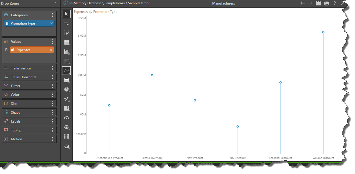
The Lollipop chart is similar to the Point chart in that it plots data points across Cartesian coordinates (an x- and y-axis that meet). However, it also shares similarities with the column chart, as it displays a vertical line for each category on the x-axis , beginning at the start point on the x-axis and ending at the data point.
While the lollipop chart is functionally similar to the column chart, it can be more visually appealing in some scenarios. Pyramid also supports functionality for lollipop charts that assist in optimizing the chart for display of multiple hierarchies. While column charts can also be used to display multiple hierarchies, it can be visually overwhelming and difficult to read if the hierarchies are large. When working with Lollipop charts, you can use the Color and Shape zones to easily construct complex yet sleek line charts, that display multiple data points on each line.
Build a Lollipop Chart
To build a Lollipop chart, add at least 1 hierarchy to the Categories zone, and a measure to Values:

Examples
In this example, a second hierarchy, Promotion Type, was added to the Color zone. The chart color is now driven by the promotion type, with each line displaying multiple data points:

Here the Promotion Type was also added to the Shape zone, so it drives both the color and shape of the data points. The Promotion Type elements are now displayed in a combined color and shape legend:

In this example, 3 different hierarchies were added to the chart: the categories on the x-axis are driven by the Promotion Type hierarchy, while color is driven by the Purchased Bike hierarchy, and shape is driven by Gender. The result is a readable chart displaying net profit for promotion type, according to gender and whether or not a bike was purchased. Such a chart can reveal trends or disparities that can then be utilized to take data-driven next steps::

In this example, both overhead and net profit are plotted for the Manufacturer hierarchy. Net profit was added to the secondary axis, automatically colorizing both measures. The measures were then also shapified to optimize readability:
